Forklift
Role: Lead Researcher
Team: Ben Weisz, Tina Nguyen, Tianyu Li
Platform: Desktop
Tools: Sketch, InVision, Quicktime
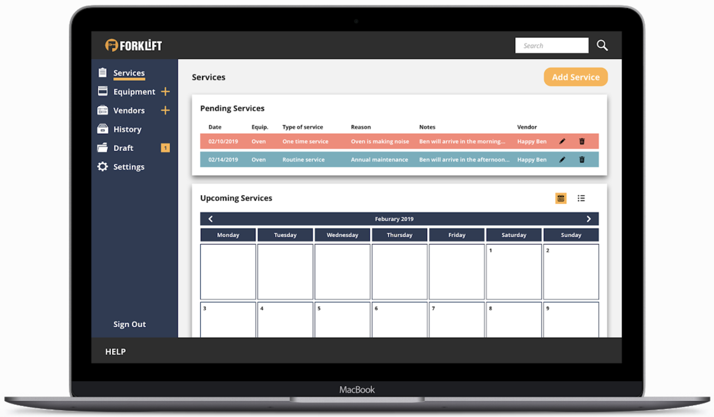
Project Overview: Forklift is a repair and maintenance platform designed to help General Managers stay organized in the restaurant space.
Challenge: Forklift’s current MVP was making it harder for general managers to document new and routine services.
Solution: A re-design of Forklift’s MVP to improve functionality for general managers.
research
Competitive Comparative Analysis
Interviews
Competitive comparative analysis
I decided to do a competitive and comparative analysis in order to understand the market for repair and maintenance software. This also helped me see how Forklift compared to its competition.
Key Findings:
Forklift’s competition was using either responsive web design or a native app
Forklift’s competition had a channel to communicate with vendors
Forklift was the only platform with routine or upcoming task reminders
Forklift had the option to upload permits, licenses, and warranties
Interviews
I conducted 3 interviews and a usability test with current users of Forklift’s MVP model.
At the time, three general managers were using the current platform.
They remained as our target users.
synthesis
Affinity Mapping
User Persona
ideation
Feature Prioritization
Sketching
Design
Usability Testing
Style Guide
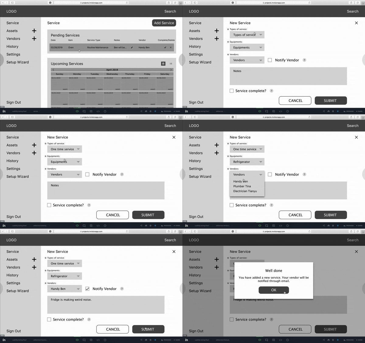
Clickable Prototype
affinity mapping
We used affinity mapping to synthesize the feedback received from the interviews and usability tests.
Key insights included:
Flexibility: Providing optional input fields
Efficiency: A way to auto-save progress
Clarity: Layout of upcoming services
user persona
We created the persona, Joe to represent the interviewees.
Defining the problem:
When kitchen equipment breaks down, General Managers will need to document & fix the equipment. This process helps keep track of problematic equipment and keeps his managers aware.
How can we help Joe organize, document, and notify his team regarding repair and maintenance?
Feature prioritization
Using the Moscow method, we prioritized the most important features to be include in Forklift’s complete redesign.
sketching
Through a design studio process, we went through multiple iterations while sketching.
usability testing
Once multiple iterations were made during sketching, a med fidelity usability test was presented to the general managers currently using Forklift’s original platform.
test findings
After multiple tests, the following features proved to be most important to our users:
Having the ability to auto-save work.
Providing an in-line error response when a required section is blank.
Calendar view is most useful starting on a Monday, vs Sunday for restaurants.
Flexibility, allowing users to enter information as their repair progresses.
Customizing the frequency of any recurring service.
Replace drop downs with radio groups.
style guide
During our client meetings, we discussed keeping the original logo, but revamping the original colors of Forklift to emphasize trust and professionalism, by expressing more of their blue and gold colors.
clickable prototype
reflection
Next Steps
next steps
Automate the on-boarding process
Design for mobile


